Since it looks like I may have an alteration to my teaching assignment next year, I feel it is time to dust this off and pump it up.
Human Height Histogram
I started using this activity when I was teaching 7th grade. There is a lot of physical growth that happens during the middle school years, and this is a great way for students to look at data that is meaningful- data about themselves.
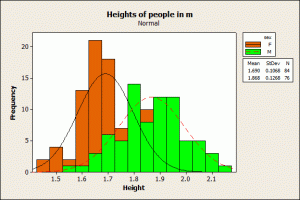
We start by making predictions about which gender has the greatest average height at the beginning of the year. Typically in 7th grade it was the girls, and we devise a way to determine it. Students come up with a way to determine the mean height of both groups, which usually involves measurement since students are not accurate with their actual height. We spend the day measuring all the students in the grade, and then look for the measures of central tendency. Students will tell me the range, median, mode and mean of each gender, and they also are curious how that stacks up for the group as a whole. I ask them how we could display this visually and they immediately tell me to graph it. The type of graph will vary however, many 7th graders are overly “precise” in their measurement of height since they are trying to be taller than their friend. The number one graph of choice for my students has been a bar graph, so I allow them to try this method. After attempting to draw a bar for each student, they decide to use a different graph. This normally results in a scatter plot where we use different colors for boys and girls. My 7th graders are not particularly adept with reading scatter plots yet, and will complain about the representation, saying that it is more confusing than looking at a list of numbers. So we brainstorm for a new idea.
After students struggle with other graph types, I ask them if they would want to go back to a bar graph. I usually get a unanimous response of “YES!” We talk about how bar graphs display data, and I ask students if instead of graphing each individual student, if we looked at graphing heights instead. Students think on this a bit and then get into how this could help or be more complicated. They also start arguing about the heights that we recorded, saying that there is too big of a variation of heights to graph. I suggest “grouping” heights together. Students really latch onto this idea, and we brainstorm on how to group the heights. Typically students either decide on 1″ or 1/2″ intervals. They then get to work graphing the heights and how many occurrences there are.
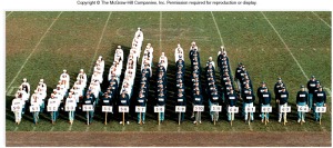
One thing I do during the measurement process is take a picture of each student as they are being measured. I then print out everyone’s picture (normally a head shot, and typically multiple ones- some on colored paper) and when we as a class believe we have a good graph, allow students to “graph themselves” on the wall outside my door. This creates a visual of the class overall. We then create a bimodal graph slightly below it that represents each gender. (A sample is below, but I no longer have pictures of my student ones so this is shown generically)
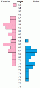
Students typically do not like this because some of their faces are covered. So we represent it in another way with a vertical histogram, females on the left side and males on the right (stole this idea from Stem and Leaf plots). This give students a great visual of the height distribution by gender.
This is what I want students to analyze, I even take them outside and take a picture of them in this format. They make conjectures on why this distribution occurs, what it may have looked like in earlier grades, and what it will look like when they graduate. I then ask students to make predictions on how much they will grow over the school year, and we create one last vertical histogram from that. Then we wait.
At the end of the year, we go through the measuring process once again. We determine the measures of central tendency and graph our results. Students then compare their predictions to the actual results. When I ask students to compare the two, I get all sorts of humorous reasons why things may or may not line up. “I drank coffee every morning this year because I was tired all the time, Mom told me coffee stunts my growth,” has to be one of my favorite student comments.
Now that I will be teaching high school as well, this will be a fun multiple year project, I may have issues storing graphs for a few years until I measure my students again, but I think it will be a great extension to this. When I dust these off for the seniors, I can’t wait to hear what their comments are, what the remembered about it, and what kind of estimations they now come up with for their height distribution.


So now, to implement this into a 3 Act lesson…